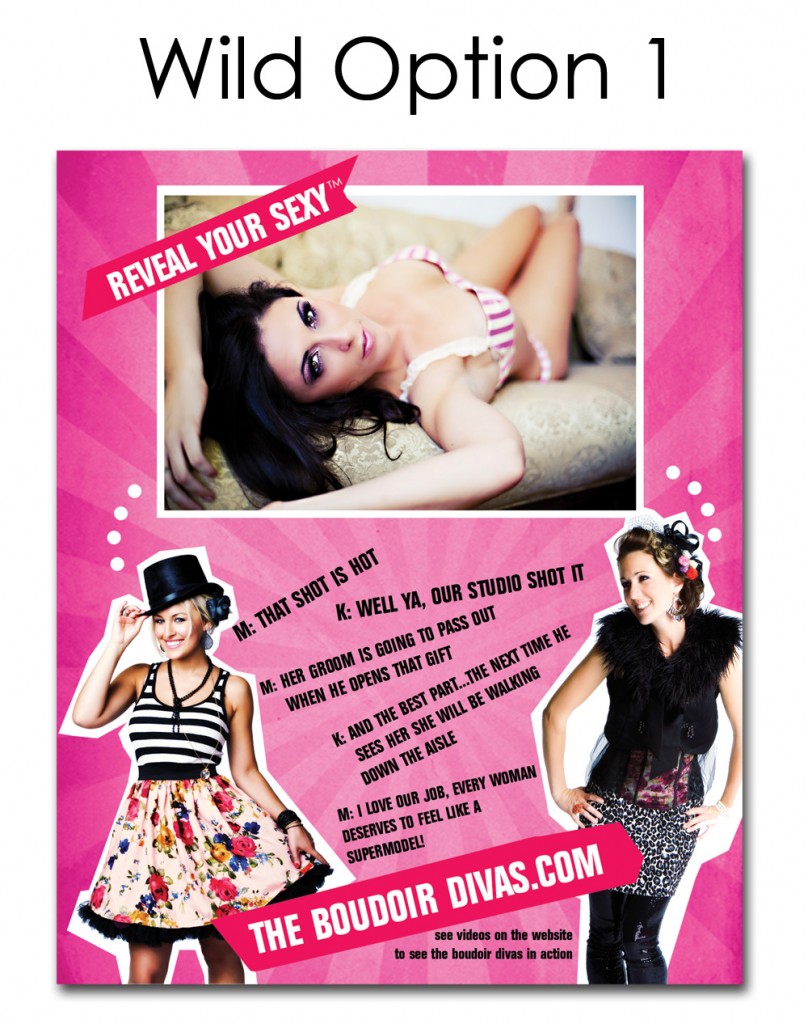
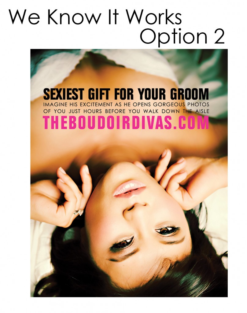
Ceremony magazine is so dang sweet to us. They will be doing a boudoir feature on us in the next edition, YAY!!! And we will also being doing a full page boudoir ad with them. This is where I need your help….So I can’t say that I am indecisive. No, I am actually quite decisive in that I answer very quickly. What I do tend to do though is change my mind five-ten minutes later. And then again, five to ten minutes after that. Well, I never said I was perfect. Lol. In fact I could never take myself too serious because then I couldn’t possibly be taken seriously. If you know me personally you prolly know exactly what I am talking about. ~M
SO PLEASE HELP US OUT!! LET US KNOW WHICH ONE YOU LIKE BETTER BY LEAVING A COMMENT BELOW. THANKS! 🙂


guys i love your work. the first one is fun. but i totally love the second option. its dramatic and romantic.
In my opinion, I like the second one. You are talking to you audience instead of each other.
They both are great but my fav is We Know It Works.
THANK YOU for the feedback! Please help us decide, everyone… leave a comment and let us know which one you like better! 🙂 Thanks! -K
I think the “Wild Option” is much more YOU guys. Why not take the risk??
Ohhhh, this is tough! Your website totally has a new look which Option 1 will flow with, and might really catch someone’s eye. Option 2 is such a gorgeous picture. This is a really hard decision. Because I am a fan of you both, I would pick number one because I love seeing you and watching your videos, BUT if it was my first time hearing about you guys I would want it to be about me… I am going to have to go with–Option NO.2–The bottom picture would be more about “me” and something I could envision myself looking like.
I like the second – it’s sophisticated and classy… and from what I’ve seen around here the last few months, it’s more like your business and personalities than the first one. If I were flipping through the mag, I’d be more apt to check out the second ad than the first.
I think the second one gets the point across sooner, easier, and more dramatically. Plus I like the simplicity of it. Yeah, that’s it, it’s simply dramatic. Just the right combination!
Option 2 for sure. It holds the viewers attention longer.
I LOVE the second one!! Its beautiful… makes me wanna do the shoot!!!
I love #2 except her hands distract me. Want it simple. Good luck!
First one is really cute! But I have to say the 2nd one would catch my eye first…
Her hands don’t distract me at all! I think they totally add to the picture and without them it just wouldn’t be as beautiful!
I like #2 better but I’m not crazy about the picture in it. I prefer the picture of # 1. I’d like to see something with more open eyes.
Definitely the 2nd option! Love the photo and the entire caption. It drew me in more than the first one….LOVE it.
I have to go with the 1st one all the way. No.1 it’s shows so much of what u gals do and who u r, No.2 it is fun, bright, and full of motivating info. While the 2nd one is nice, I think it is too specific and doesn’t display much about what you do! <3 all you do!!
I’m loving the second one. Although, you guys’ outfits are particularly adorable.
I really like the style of option 2 but I am not too fond of that picture, she just looks a little weird.
I agree with the others. Number 2 for sure. I think the photo is dramatic and feels very sultry! Number 2 for sure!
Option 2…Love that one!!!
i LOVE the first one.
The second one for sure! First one is fun, but I think the second one grabs your attention more – which is what you want in an ad! Goodluck! xoxo
I think with your website…you go option 1. Here is why (btw I am a marketing manager at my day job): it is your brand. It shows it, breathes it and talks it. If your website is the extension and voice of your brand, then the first ad fits it perfectly. So that is my 2 cents!
LOVE the first one!!! but maybe a more sultry photo… just a thought… Love the vibe of the first one,,, but the pic in the second…
It seems that #2 is the most popular and I also like it…however it seems that her head is detached from her body with the amount of blur around her neck.
Beautiful work!!
Definitely #2! I like how fun #1 is – but #2 is big and bold and catches your eye quicker. Flipping through a magazine, I would stop to look at #2!
I really love the second one ;0))
In the context they are shown, I’m drawn to #2, I love it’s beauty and simplicity. BUT, when it’s placed in a magazine, with so many other beautiful photos and (somewhat) similar looking ad’s I would be less likely to notice it. SO, I vote #1! Also, #1 helps establish your ‘branding’ persona. 😉
I agree with Erica. Definitely go with option number one. It screams who you gals are (which is nothing short of fabulous) and is consistent with your website and new “brand” and “look” of the Boudoir Divas. Choice number two would be the “safe” choice as you know it works…but you’ve used that one before…so what’s the fun in that!?? Take the risk…and fly with fabulousness and consistency!
ps. One day, when Gob blesses me with Mr. Right and I’m about to walk down the aisle…I’m so flying my Canadian booty down to San Diego for a shoot with you lovelies!
I like both.. but… #1 is you guys, fun, hip, cool. I’d change the picture. #2 is very wow, dramatic, draws you in. You’ll rock with either, but if you do choose #1, put a more dramatic picture in there.
I am just LOVING hearing everyone’s thoughts. Thank you so much guys. It means a lot that you are taking the time to help!
I love both but #2 speaks to me the most. With #2, the image is very eye catching and draws you in, it tells a story and the audience can visualize it much better.
Hmm…actually I’d take the first one, but change the text up a bit maybe… The second one’s classic, but I guess all the other adds in the magazine are, too, so it won’t stand out that much 🙂
The second option is quick, to the point and the focus is the woman, so I tend to favor that one. However, the first option shows your personalities and more descriptive and would be good in advertising where you are unknown.
While I like them both, it seems like option 1 might be a little more in line with your branding.
Totally and 100% number 2! You want them to come to the website and then they can get the feel of #1 once they are there…Rock it ladies!
I like the first option! I like how you say “every woman deserves to feel like a supermodel” so they know it’s for everyone… not just model types. 🙂
I have no idea why…but that first one pops out at me…For a variety of reasons.
1: While flipping through pages in anyone of the magazines you plan on advertising in that one WILL certainly POP OUT! Especially the pink border.
2. It is very BOUDOIR DIVAS
3. It’s different
4. The other option is a gorgeous photograph, however it is just a photograph, with some words and when I look at that add I tend to look more towards the photo then towards the print and I ALMOST don’t care about reading the rest.
5. Option number one just stands out…plus I am a huge fan of promoting who YOU are and the first option makes me feel like you girls would be a blast to work with and if I were a woman I would want to be photographed BOUDOIR style by you!!!
I hope this helps
Julian Moniz
I love option Two!!
Definitely #1 for the picture!!! #2 is distracting with the hands but I like the wording you have on that one.
I think that option two stands out with the stunning imagery! And it is more geared toward a bride which works for the magazine it is going in! It is sophisticated and romantic and perfect!
I like them both. Option 1 screams fun, exciting. It is nice for clients who do not know you to see your faces and it is easier to envision themselves DURING the photo shoot, having fun with you guys. Option 2 screams stunning beauty, and the image is more of an impact than #1… Even though I like the image in #1 better. It’s the size that has more impact. What do you want your target to be? I think more people might end up choosing #1, it seems like that one may do a more “convincing” job to pick up the phone and call. #1 plants the seeds better than #2 as far as the client envisioning product in their hand goes. What if you made the image in #1 fill the width of the page, and make the images of you guys a little smaller. Might have more impact. Also, check around and watch people view them in person – despite whatever one they may like better, the one that works will be the one they stare at longer. Good Luck!
WOWZERS! Love it! How are you guys so amazing!!!! I can barely make my cellphone camera work…xo
I would personally be more attracted to number 2 than number 1
They are both great but I like the first one best. It shows you in the ad and that would make me want to book a session more than the other. It’s more personal.
I think option 1, you selling yourselves as much as your photography. As women we see ads like the second one in magazines everyday, they may just as easily flip past it. If your spending money for a full page ad, go with what will jump off the page…that’s what your doing it for right?
Take the risk with the new one. They’re definitely both awesome, of course- you’re the DIVAS! If you don’t see the results you’d like, you can always change it up or switch. Go for it! :} Great job as always!
They’re both great…but #2 SELLS!
Oh my goodness… I am LOVING this awesome blog participation! Thank you, thank you, thank you! I think this might be a record for us on the high number of blog comments. 🙂 We love hearing feedback from out blog readers – thank you!!!! xoxo
I love them both, but number one stands out more to me, I’d want to know more about the Divas after reading it. Perhaps make the photo bigger , and since the Diva’s entire bodies aren’t featured already, maybe decrease your size a little teeny bitty more to make the main pic a little bigger…. just a thought, LOVE them both!
One. totally number one.